
Thursday, July 14, 2011


Nominal Area Choropleth Map
Nominal area choropleth map classifies nominal data in choropleth fashion
Unstandardized Choropleth Maps
Unstandardized choropleth maps are NOT areally averaged choropleth maps.
Standardized Choropleth Maps
Standardized choropleth maps are areally averaged choropleth maps. Common ways to areally average choropleth map data are density and percentages.
Univariate Choropleth Maps
Univariate choropleth maps measure only one type of data in choropleth style.
Bivariate Choropleth Maps

Bivariate choropleth maps measures two types of data in choropleth style (areal units) simultaneously. The map above shows the percentage of votes for John Kerry in the 2004 presidential election versus each county's population in the year 2000. There are two color continuum's, one for population and one for the percentage of votes for Kerry. The places with overlap show how population and a high percentage of Kerry voters, the places that are green show high percentage of Kerry voters, but low population. The purple areas just show high population. The white areas are neither higher populated nor high percentage vote areas for Kerry.
Unclassed Choropleth Maps

Unclassed choropleth maps are choropleth maps that have as many intervals as there are areal units (no set amount of intervals). This map shows the distribution of deliberate fire-starting across London by wards. Note that since there are as many intervals as there are areal units (wards), then one can only compare areal intervals relative to each other, but not by any orders of magnitude. For example, the most fires are in the dark red ward, and the least in the palest yellow. However, one would not be able to tell the difference between any given data set in between other than the fact that the color continuum would tell you one has either more or less incidents of deliberate fires.
Classed Choropleth Maps

Classed choropleth maps are choropleth maps in which areal units are combined into a smaller number of groups and portrayed in intervals. Classification techniques include equal steps, quantiles, natural breaks and minimum variance.The map above shows a region which has experienced varying population changes and is represented by five intervals. The data is equally spread out among those intervals meaning that since there are 67 counties, and 5 intervals, then each interval contains a little bit above 13 counties (on average). This is the quantile classification method. However, an aspect that is misleading about this is that each county might belong to the same interval, but have huge differences in actual percent population change since the data might have jumps within intervals (and while the amount of of data is equal in each interval, the range of each interval is not).
Range Graded Proportional Circle Map
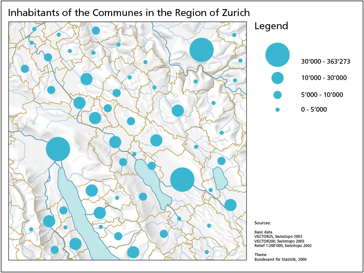
In Range graded proportional circle maps only a set number of circle sizes are used to depict the variable (unlike the Continuously variable, where an indefinite amount exist). This map shows inhabitants of the communes of Zurich, Switzerland. The disadvantage of having a set amount of circles represent the entire data is that the circles do not represent actual inhabitants in those locations, but rather a range. So while circles of equal size might seem to indicate equal inhabitants (for example the 3 largest circles on this map), they in face represent varying inhabitants, anywhere from 30,000 to 300,000 inhabitants. This is a huge difference when one takes into account that the rest of the circles represent the range from 1 to 30,000 inhabitants.
Continuously Variable Proportional Circle Map
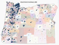
Continuously variable proportional circle map shows a circle whose size is directly proportional to the value of the data measured, where increase in the data is shown by slow increase in value. In the map above, school enrollments is the data interest, represented by circles who are proportional to the amount of students enrolled in that specific location (where the circles hover over). A problem with this map type is when a concentration of circles, like seen in the Washington-Oregon areas, start to clump up. This can make overlap really hard to avoid and hence represent the data correctly.
DOQQ

DOQQ combine the image characteristics of an aerial photograph with the geometric
qualities of a map, only with the added benefit of being georeferenced
and orthorectified. This allows the image on the map to be useful for measuring true distances of the specific locations- in this case Washington D.C. (since it has been adjusted for relief, lens distortion and camera tilt. 
DLG

DRG

Digital Raster Graphics (DRGs) are scanned images of U.S. Geological Survey (USGS) topographic maps. DRG's are georeferenced to the surface of the earth, and are used as references for other maps (DOQQs and DEMs). This map gives a base cartographic information of the Colorado river and its surroundings in Texas.
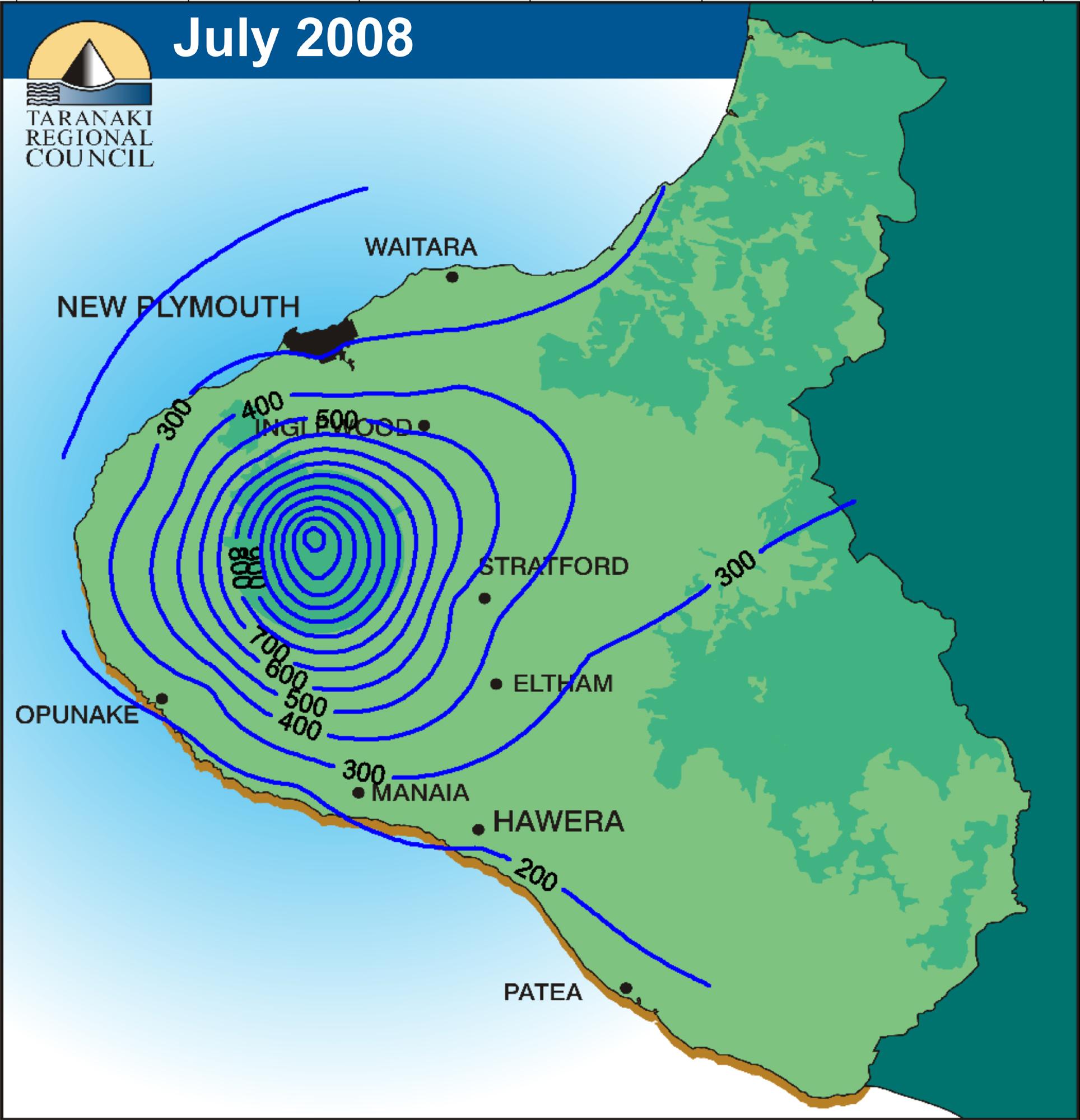
Isopleths

Isopleth is used for contour lines that depict a variable which cannot be measured at a point, but which instead must be calculated from data collected over an area. This map shows wind speed averaged from 1946 to 1994 around the Columbia River. Note the positive and negative slopes of the winds during different months (positive in the winter months, negative in the summer months). The distribution in wind speed is apparent by season.
Isopach

Isopach are maps that have lines that connect areas of equal rock or sediment thickness. This map shows the Purbeck Limestone formation of Southern England and the English Channel. As with all Isoline maps, distribution and concentration is apparent, with the thickest formation in the Weald basin (shown on the "hill" of the map).
Isohyets
Isohyets are maps that have lines that connect areas of equal rainfall. This map shows the rainfall of the
Isotachs

Isotachs are maps that have lines that connect areas of equal wind speed. The above map of U.S wind speed shows high wind speeds concentrated above Montana and North and South Dakota that descend and influence Mississippi River Valley Weather. This wind chill contributed to the weather of Alberta (which was near the 40 degrees Celsius mark)
Isobars

Isobars are maps that have lines that connect areas of equal atmospheric pressure. This map shows the atmospheric pressure above northern Utah and shows a peak of pressure fall in the blue tint to the bottom left.
LIDAR

LIDAR utilizes laser pulses coupled to a global positioning
system to develop highly detailed images of earth surface phenomena. This image shows Kansas City, MO in full detail. This technique seems akin to echolocation, except the image is returned in color.
Subscribe to:
Comments (Atom)